First published in the VAN (Visual Artists News Sheet) 18 March 2022.
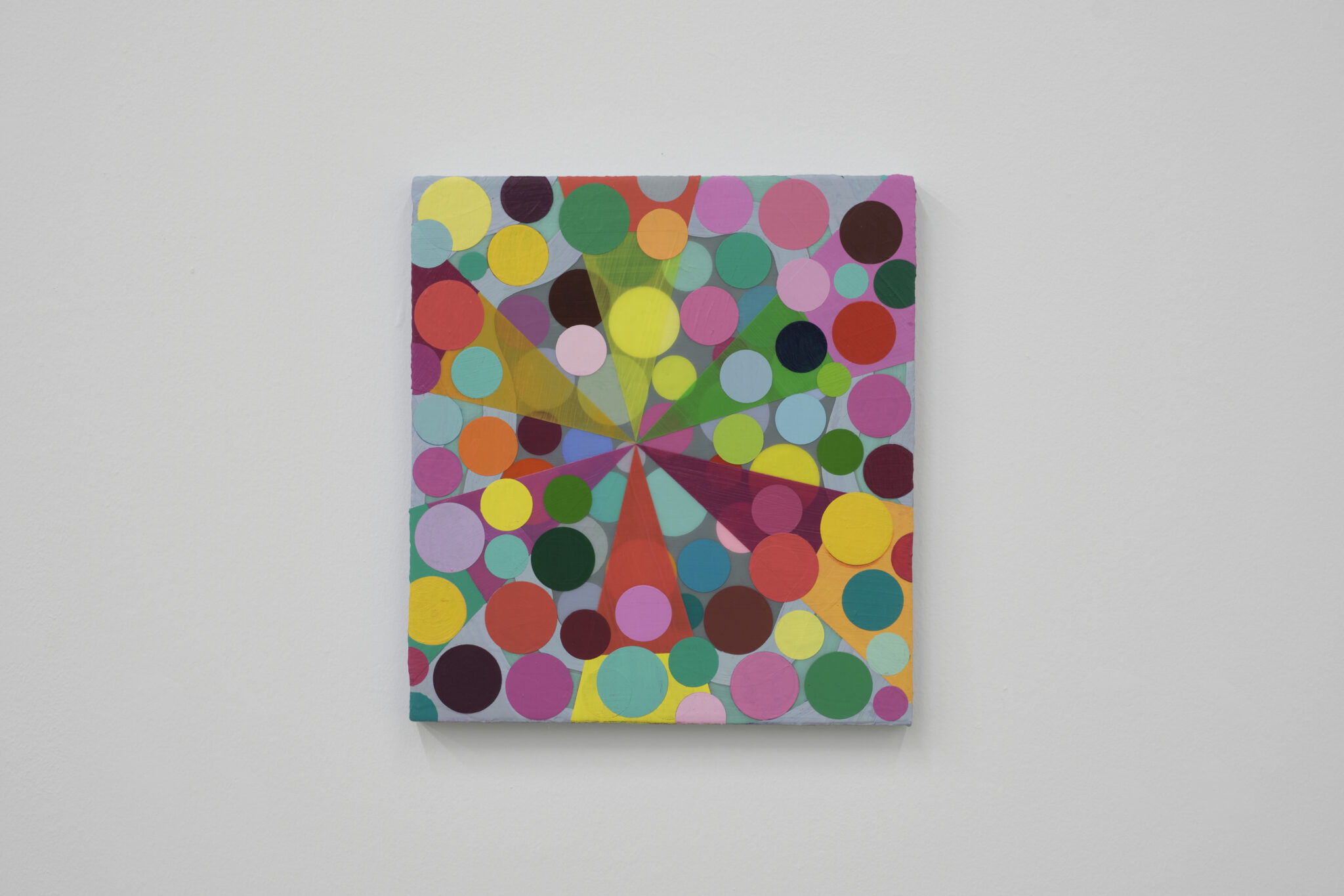
Ronnie Hughes’s solo show, ‘Isobar’, comprises 21 works on canvas, linen and plywood (from 2020 and 2021) as well as a series of 11 works on paper (from 2015). The former range considerably in size, the largest of which are very large indeed (214 x 183 cm). It is this fluctuation in scale, as well as the joyous colour palette, that strikes one immediately on ascending the stairs to The MAC’s Upper Gallery.
As a title, ‘Isobar’ is significant. Not in its meteorological sense, but rather in how the artist views it as a ‘conceit’, a drawing of something imaginary that “we’ve conjured up to create a kind of structure in the world”. The works in this show are full of structures – grids, lattices, clusters, networks. Of interest here also, when considering some of the pieces, is this human attempt to pin down something which in nature is in constant flux and extends beyond the confines of wherever we choose to point our observational instruments at, in any given moment.
The paintings’ surfaces retain traces of their evolution; raised hard edges bear witness to elements that have been painted over, having shifted in scale or position during the painting process. Thus, one assumes that once an initial armature has been established, or at least tentatively agreed upon, that much of the extraordinary number of choices to do with colour and balance (and imbalance) are worked out empirically on the surface of the canvas, rather than being predetermined. Surfaces also show subtle differences in transparency and finish; some elements appear matte, others have a glossy sheen, while others still achieve a Perspex-like translucency – the luminous and explosive Surge, 2020, contains all three of these variants – a result of Hughes’s experimentation with pigment and co-polymer medium, with layering and glazing.
Several of the canvases share a similar framework and operate as pairs, at times with surprisingly different outcomes. In Blink, 2021, and Dazzle, 2021, for example, the latter, as if stepping behind a tapestry, is like the muted verso of the former’s recto of rectangles, squares and spots. Even more surprising is the pairing of Palimpsest, 2021, and Waltzer, 2021. The former is a graphic series of overlapping letters in ticker tape lines with a subtractive colour relationship (incidentally, the painting strikes a distinct note in an otherwise cohesive grouping of works until contextualised by the ‘Artificial Birdsong’ drawing series in the second room). Palimpsest began life as an alternative version of the similarly-sized Waltzer but evolved very differently – the dot on the letter ‘i’, appearing several times and echoing the dot-covered Waltzer next to it, perhaps the only clue to their shared beginnings.
Waltzer is reminiscent of the scattered contents of a hole-punch receptacle. On closer viewing, however, one sees that the coloured spots on a muted teal background are not placed randomly but rather carefully arranged in a series of overlapping pairings. Yet the overlaps are uneven, in some instances the upper spot revealing at least half of the one below and elsewhere only allowing a thin sickle to peep out. As with many of Hughes’s works, once you think you have identified the underlying structure or system at play you immediately see the exceptions – the artist’s deliberate frustration of our assumptions that threaten to destabilise the structure. It is tempting to pick out these nuggets: the lone grouping of three dots in a canvas full of two-dot pairings (Judder I, 2021); the single crooked vertical in a dense lattice of right angles (Within I, 2021); the one slightly offset spot in Dazzle, and so on. Yet to do so, to treat these elements solely as compositional tricks, is reductive. Of more importance is how they operate on us semi-consciously, bringing vitality and movement. They are the little anomalies that make the works more fascinating, where Hughes has “let nature intervene […] to create something that’s just much more interesting to look at”.
Thicket I, 2021, and Thicket II, 2021, are a mesh of overlapping and intersecting lines of primary, secondary and tertiary colours on an off-white background. They are like schematic diagrams, yet do not fulfil this function. Their structure is not entirely contained within the borders of the canvas and the points where lines converge are each treated differently. The eye tries to resolve the structure, to see it in a single comprehensive state but cannot – there is too much movement going on. Other works, with Op-Art borrowings of waves and grids, have this sense of movement. However, this pair in particular seem to have the potential to expand in space – as if we were viewing a small section of a larger whole beyond the canvas borders – and in time, as if the work were a frozen frame of a structure in constant movement and reconfiguration.
The masterful use of colour throughout is a joy to experience, especially at the time of writing in the depths of winter. All of the works presented in ‘Isobar’ reveal themselves slowly and reward prolonged viewing and repeat visits. Just don’t expect them to sit still before you look again.
Jonathan Brennan is a multidisciplinary artist based in Belfast.
jonathanbrennanart.com


