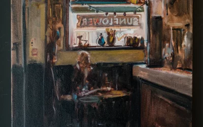

Exhibition ‘No Filter’ featuring the work of Esther O’Kelly and NOTPOP took place at Canvas Galleries in May 2023.
Discussing the work of two artists in one text generates its own particular challenges. Making comparisons and identifying points of contrast is inevitable but sometimes these can seem arbitrary: the artists might have nothing in common, other than appearing in the same show in the same gallery at the same time; they might be working in different media or cities or periods in history. However, when I consider the subjects of this text – painters Esther O’Kelly and NOTPOP (aka Matthew Knight and family) – their pairing in this show seems predestined, with nothing left to chance. The story goes that both artists (represented by Canvas) repeatedly found themselves appearing side-by-side at various shows. They have theories about why this happened: ‘We’re the colourful ones’ NOTPOP tells me; ‘we’re the two bold children’ adds Esther. Introductions followed and after a day and night of knocking about, ‘yapping away with no subject off limits’ (drink might have been taken) the two recognised even more of themselves in each other, beyond colour and boldness that is. ‘It’s me but not me’ O’Kelly reflects. A pact was made: they decided to embrace circumstance and mount a show together. Six months later, ‘No Filter’ (Canvas Galleries, 25 May to 3rd June 2023) is the result.
Some general reflections by way of introduction. Although NOTPOP later discloses that his recent use of neon pink (in Let’s Really Have Some Fun) felt brave and out of character, it is obvious that neither artist is afraid to employ a wide colour palette. Obviously though, it goes much deeper than that: there is an intelligence and sensitivity in that use of colour. Many of O’Kelly’s works vibrate with a palette of bright shimmering warm tones next to deep blues and blacks, yet also feature subtle off-white hues of cream and grey next to pure whites. I’m reminded of Mondrian’s subtle use of whites next to off-white gradations of grey and blue in his early 1920s compositions. With the Dutch master, it seemed to operate subconsciously, bringing about a sense of harmony and balance in some works, and of movement in others. I seem to remember an experiment some years back where, more often than not, viewers of Mondrian works instinctively knew when they had been deliberately turned sideways or upside-down (I search in vain for the source of this study but it has been lost in a flood of news items to do with a recent discovery of a Mondrian hanging upside down for 75 years in a German museum before anyone noticing – I suppose the point is that eventually someone did notice!). Incidentally, I have a similar experience with one of NOTPOP’s pieces (Transition): I flip it over but it seems wrong (or at least it changes what I wanted to write about it so I quickly flip it back again!). However, returning to that use of colour, equally, alongside the neons, many of NOTPOP’s paintings feature subtle gradients and gradual, almost imperceptible shifts in colour as forms run from left to right or top to bottom or overlap. As I examine each artist’s work, more shared affinities become apparent – a layering, a jostling between planes, and a sense that the more one looks, the more one sees.
O’Kelly’s largescale canvases feel like landscapes: even if almost nothing is represented literally; even if many of the colours employed are non-naturalistic; and even if the majority are portrait in orientation, they still achieve the remarkable feat of communicating as landscapes to the viewer. Seemingly, there is enough in every painting to make it feel like a landscape: in several a swathe of white reads as a horizon; in others a diorama-like succession of overlapping planes suggests depth, hidden valleys and ridges; broader areas of textured and layered paint, that suggest mountains or sky, sit next to busier more detailed patches which can read as rock formations or forests perhaps or eroded furrows in the earth. Comets and Contortions is one such landscape. The horizon rises abruptly on the left – to anyone living in the shadow of Belfast’s Cave Hill, it is reminiscent of McArt’s Fort – before shifting to a gentler angle and culminating in a sort of plateau that trails off the right of the canvas. The contours of the landscape below echo this line for a time before taking on their own distinct character of a tumbling, hacked-out glacial landscape of warmer tones. I use the word ‘contour’ also in its cartographic sense i.e. a line joining points of equal elevation, as I sometimes think of Esther’s paintings as aerial views. More on this below. As with all of her works, there is much adding and layering of paint, but also much scraping away and removing with knives, spatulas and potter’s tools, a repeated play of revealing, then obfuscating again. The paintings move towards you and away from you, visually but also temporally. The evolution that takes place on the canvas is left pretty much intact for you to see its making. However, the process is not linear; it is often difficult to tell in what order the layers of paint have been applied. If you think you have figured it out, an exception will throw you. In many of her works there is a reining in at the end, a sense on the part of the artist of knowing when something is sufficient and balanced. In Comets and Contortions this takes place across the upper area of the canvas, when a ‘horizon’ is formed by the addition of impastoed strokes that act to contain the action happening underneath. But even then, there is more to see – that richness still shimmers below, gone but not forgotten.
You always feel somehow how close or distant you are from O’Kelly’s landscapes, what kind of prospect the window of the canvas is offering. Far Away the Hills Are Greener, for example, feels more zoomed-in, more imposing, its verticality more strident, the horizon shooting up to the right – like the Matterhorn in Doig’s Alpinist – and vertically out of frame. A larger section of blue in the upper right, scraped or wiped back in repeated knife passes and emphasising the weave of the canvas, is reminiscent of the rock formation known as ‘The Organ’ at the Giant’s Casuseway (incidentally, NOTPOP made several pieces in 2021 inspired by the same basalt columns on Ireland’s north coast). Throughout O’Kelly’s canvases, this knifework provides a rhythmic vertical dynamism. The marks, reminiscent of Cézanne’s treatment of foliage, are always vertical or just-off vertical, at most a 45° angle. Even Above the Road, one of the few landscape-format paintings, is defined by its verticals. Again, one can see the work being worked out on the canvas, intuitively one assumes, until the artist instinctively knows the work is complete.
In Everything Changes, the section where one might have come to expect a bright horizon is plunged into darkness, yet somehow it does not read like a night sky. I have the impression here that I am looking at an aerial photograph. Over the black a deep-blue layer of acrylic paint has been applied then ploughed through with some implement, like a notched tiling trowel one imagines. The effect is repeated just below, where a creamy salmon is scraped away to reveal watery blues, and the sensation is of waves lapping against a coastline. Starless Rivers seems to combine both prospect view and aerial view, the overlapping reds and gold of the background reading as distant hills, beyond which the sun is rising, the Y formation of the more detailed lower half like looking down on the meeting of two of the titular rivers. Here the revealing of the lower levels of paint through the upper is more scratched than wiped, like sgraffito.
Gone Astray’s landscape sweeps upwards like some vast tidal wave before reaching a clay-like neutral. It is enveloping but not threatening and I wonder why that is. Is the studio or gallery affording the ‘refuge’ aspect of prospect-refuge theory, gazing out over the prospect of Esther’s ‘remembered landscapes’, or is it that they are simply beautiful to run one’s eye over. When I ask about the verticality of the works, O’Kelly tells me that ‘you move through a landscape in that way if you’re a culchie, you’re hurrying through it, not dwelling’. I recognise that kind of tunnel vision one experiences while hiking, always looking for the path forward, however, I certainly do want to dwell in ‘Estherland’.
An initial, superficial glance at NOTPOP’s work in ‘No Filter’ makes me think of the world of street art and tagging. However, to anyone reading who thinks the (admittedly catch-all) term is in any way derogatory perhaps has not witnessed the staggering levels of accomplishment and diversity this artform has achieved in recent years, not least in Belfast. There is a linear, angular, typographic quality to the pieces that use a vocabulary of outlines, overlaps and drop shadows – but it’s one which is extraordinarily refined. It is as if NOTPOP has lifted Roy Lichtenstein’s zig-zag Pop Art brushstrokes, already stylised versions of the real thing, and taken that process of refinement as far as it can go: distilling them to their essentials yet somehow making them more complex. My flight of fancy seems to echo the words I later come across from NOTPOP: ‘a quick doodle turns into a more intricate piece of work with bold colour choices’. And although the artist’s stated aim is to ‘to make a body of work that fits somewhere between Pop Art and Abstract’, that is the last Pop Art reference I’ll make in regard to someone calling themselves NOTPOP!
NOTPOP seems, among other things, to have come from a street art background. I’m not as familiar with his earlier work, but in conversation he refers to work from the past as ‘stuff he used to just splurge on the wall’ or ‘not something he saw that people could relate to’. Now he says things are ‘more structured’. I suspect he is being overly self-critical (artists are good at that) but he seems nevertheless confident and content about his current work – and so he should be. The second thing you notice, when viewing several of NOTPOP’s pieces in the same room, is the framing. Highly irregularly-shaped pieces have similarly irregular, angular, tray frames that follow most of the angles and turns of the pieces they contain. At least that is my initial assumption, but as soon as I take a closer look at works like Ripple Effect, Watching Every Motion or Transition I realise the frames and the works are not two separate entities – they are, in fact, integral. Apart from a shift in colour, it is not possible to see exactly where work ends and frame begins; for the most part, they are one and the same. Before getting into details, as a side note, I have to say that every time I attempt to describe what is going on in NOTPOP’s pieces by using any kind of shorthand descriptive terms, the works throw me – they elude simplification and really have to be seen in person. With that in mind, I shall try to describe what is going on in Ripple Effect. Two offset M-shaped zig-zags span this landscape-format work. The lower-level one, which reads as being closer to us, is teal, while the one ‘behind’ it is turquoise. It is as if they are both sheets of Perspex, laid one on top of the other, and where they overlap the combined teal and turquoise produce something approaching a celadon blue. So far so good, but there is more. As these serrated lines move from left to the right, they shift in tone in three or four steps: the teal gradually lightening to approach aqua, while the turquoise approaches a pastel green or mint. Even the overlapping areas lighten accordingly but my colour vocabulary fails me here. NOTPOP confirms that some of the working out of composition and colours is done digitally, in advance, but he leaves room for changes as the works progress. Suffice to say, these are obviously meticulously planned and carefully executed works – and at this point, I have only discussed colour! In terms of physical structure, there are subtle elements in the cut shapes of these works – some of the upper lines hint at a 2.5D effect applied to the lower ‘M’, the angle of which could easily have intersected with the descending lines of the rear ‘M’, but they don’t – NOTPOP giving himself a few more tiny notches to carefully cut around. These are details I only notice on closer observation – I suspect for many the overall effect will be of dynamism, a feeling of movement operating subconsciously, without our realising. I find myself thinking again of Mondrian’s early regular-grid works like Composition with Grid 9 or Lozenge with Grey Lines (both 1918) in which subtle changes in line width or shades of grey operate to create a shimmering effect.
Watching Every Motion is, in contrast, portrait in orientation, yet has a similar suggestion of overlapping zigzagging lines. Here however, there seem to be more lines, they are more compressed, the overlapping more complex, and the level of offset increasing in small increments. I struggle to describe this piece in more detail than that without tying myself in knots! A section in the middle calls to mind Bridget Riley post-1986 works (after her introduction of the diagonal line) like High Sky (1991) or Nataraja (1993). NOTPOP’s pieces have a high degree of finish but in many the brushstroke has not yet been smoothed out of existence – they are still very much paintings. And despite their deceptive complexity, they are not academic – they are very beautiful and desirable and fun!
Viewing Transition is like gazing out over a computer game landscape of winding paths, pitfalls and platforms that seems to recede towards a horizon of sorts while The Wiggle seems to be a step in a new direction. In the latter work, not only is the overlapping of Z forms suggested in paint but also rendered in real life. The Zs are cut from thin wood and stacked, offset from each other. I cannot decide if the painted overlaps are working with or against the actual overlaps but some kind of contradiction or complement is at play. Even the visible grain of each cut wood element seems to alternate at right angles to the layer preceding it. There is a subtle gradient that moves from a turquoise to Naples yellow – a beautifully-rendered transition which is allegedly inspired by the sunsets seen from NOTPOP’s workshop in Tyrone. On this theme of landscape, I ask about what I refer to above as a kind of horizon in Transition, and apparently that too is an oblique reference to a blue sky and an echo of how O’Kelly employs horizons.
It would seem that working over the six months together on this show, ‘watching what each other was doing’, has introduced a certain degree of cross-pollination: visually, as in the case of the NOTPOP works just described, but also temperamentally. Following a recent studio move and the inevitable interruption this brings to one’s practice, the prospect of a joint show gave Esther a focus, a push and an excuse to ‘explore her wackier side’ and ‘find the joy in it again’. NOTPOP says he was influenced by Esther’s use of multiple colours in a single piece.
And so we have ‘No Filter’: a lack of inhibitions, a directness, a social media hashtag, a chance meeting of minds, and an ironic title in that if landscape is an influence (it certainly is in Esther’s work and is perhaps creeping more so into NOTPOP’s works) the work could not be more filtered through the very individual approaches and processes of these two singular artists.
Jonathan Brennan. May 2023.